


.jpg)


.jpg)


Okay, so I made this layout a couple of days ago and wasn't very happy with it. I used my K&Company paper, some cardstock from my pile of paper and the Don Juan cartridge for the word laughter. It might look better with pictures covering the white cardstock, but it just wasn't working for me. So I went back to my supplies to see what else I could add that might look better.  I covered thed white mats with more K&Company paper, added a layer of orange printed paper to the peachy colored cardstock and a little ribbon to the top. It's still not my favorite layout, but I think it looks much better than it did. I've never been good at combining patterned papers so this was a little difficult for me (I think I mentioned that in my previous post). If you have any tips for me I'd love to hear them. In the mean time I will keep trying and see what else I get out of this tablet of paper. Thanks for stoppin' by.
 I covered thed white mats with more K&Company paper, added a layer of orange printed paper to the peachy colored cardstock and a little ribbon to the top. It's still not my favorite layout, but I think it looks much better than it did. I've never been good at combining patterned papers so this was a little difficult for me (I think I mentioned that in my previous post). If you have any tips for me I'd love to hear them. In the mean time I will keep trying and see what else I get out of this tablet of paper. Thanks for stoppin' by.
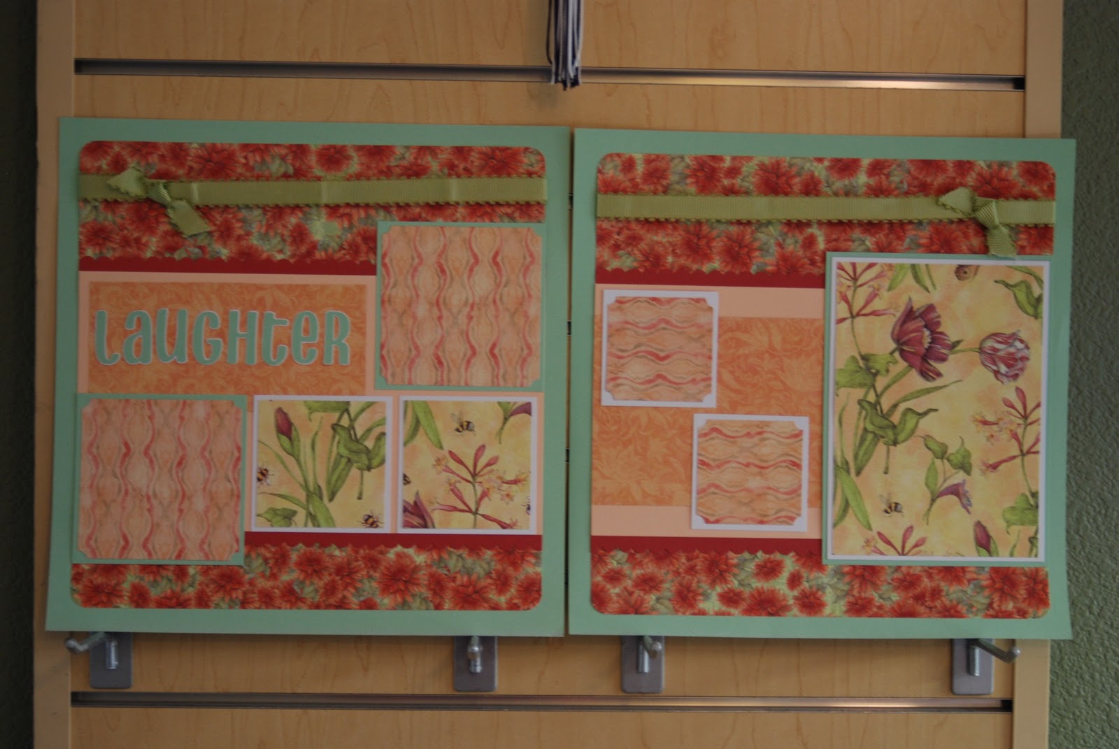


What a huge difference!!!! I liked it before, but it is incredible now!
ReplyDeleteLove the title too!
I really like this. Especially once you added some stuff.
ReplyDeleteThe only tip I have is to make something "pop" Your eye should go to something immediately. Now once you put pictures on it, you may have a pop, but right now I would probably make the title pop by adding a darker color behind it as the outline shadow (maybe to match the darker red of the flower in the paper you added.